The “Fuel vs. Engine” Reality: Why Your Expertise is Getting Stuck
You’ve spent months—maybe years—bottling your expertise into a curriculum. You have the traffic, the passion, and a product that truly helps people. So why do your conversion rates feel stuck?
Most creators assume the problem is the content. They think, “Maybe I need to re-record the videos” or “Maybe I need to add more modules.”
But after a decade of running a UX/UI design studio, I’ve learned that your content is the fuel. The real issue is your “sales engine” — and the psychological triggers for course sales that are missing.
Cognitive Friction in Course Checkouts: Why Most Sales Die Before the Buy Button
The invisible killer is cognitive friction — the subconscious mental barriers that make potential buyers hesitate and click away.
Based on my experience building high-converting products, here are the 10 psychological triggers you need to engineer a frictionless path to “Yes.”
1. Hick’s Law
The Science: Imagine it’s Friday night. You open Netflix to watch a movie. There are 5,000 titles. You scroll for 20 minutes, feel overwhelmed, and eventually… you turn off the TV and check Instagram.
This is Hick’s Law: The time it takes to make a decision increases with the number and complexity of choices. In a famous study by researchers Iyengar and Lepper (2000), shoppers shown 24 flavors of jam only bought 3% of the time. When the selection was reduced to 6, sales jumped to 30%. While modern replications vary, the core principle of cognitive load remains undisputed.
Every extra option on your page acts as a “speed bump.” Excessive decision-making creates cognitive fatigue. When the mental load gets too high, the brain defaults to avoidance—the easiest decision is no decision at all.
Avoiding the Helpfulness Trap
The Mistake: Trying to be “helpful” by keeping your header menu, social media icons, and a “Live Chat” bubble on your checkout page.
The Business Impact: You are giving your customer an exit ramp.
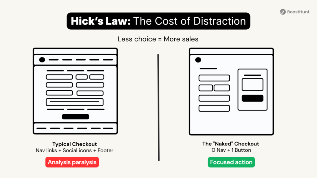
The UX Fix:
- Implement the “Naked” Checkout: Once a user clicks “Buy,” they should land on a page with zero navigation. Remove the header menu, footer links, and social icons. According to Baymard Institute’s 2024/2025 research, 22% of US online shoppers abandoned a cart solely because the ‘checkout process was too long or complicated. Across 49 different studies, the average documented online cart abandonment rate is 70.22%.
- Adopt a “Data Diet”: Are you asking for their company name, job title, and “how did you hear about us?” before they pay? Stop. Every unnecessary field is a barrier. Move non-essential “survey” questions to the Thank You page.
- Stick to the “Power of Three”: In most cases, three pricing tiers work better than five or more.
- Organize with Categorized Curriculums: If your course has 50 lessons, do not list them all on the sales page. That looks like “work.” Group them into 5 “Modules.” The brain can process “5 Modules” easily; it chokes on “50 Lessons.”
Author’s Insight: While Hick’s Law suggests reducing options, don’t just “cut” everything. For “Bundle” offers, too little choice can lower perceived value. The key is Categorization. The brain can process “5 Modules” easily, but it chokes on “50 Lessons.”
Why this gets skipped: While the logic of Hick’s Law is clear, many creators find themselves in LMS integration hell trying to make it work. Most standard platforms “force” you to keep certain buttons or headers, making it nearly impossible to create a truly naked checkout without custom code.
If you’re stuck in this exact LMS integration hell, read my deep dive: How to Launch Your Course Without Integration Hell.
2. The Law of Least Effort
The Science: Humans are hardwired to conserve energy. We naturally gravitate towards the path of least resistance.
In UX design, we know that if an offer sounds like “work” (school), the brain resists. If it sounds like “results” (a destination), the brain accepts. We don’t buy the plane flight (the process); we buy the vacation (the outcome).
This is one of the most effective psychological triggers for course sales you can use.
The UX Fix:
- Rephrase Your Messaging: Shift from “Doing” to “Receiving.”
-
- Avoid this: “Learn how to write high-converting emails” (Sounds like study/effort).
- Try this instead: “Get my 50 Copy-Paste Email Templates” (Sounds like a shortcut).
- The “No-Work” List: Explicitly bullet-point the friction they avoid by buying your solution. Don’t just tell them what they get; tell them what they don’t have to do.
-
- “No complex math required.”
- “No coding skills needed.”
- “No hiring expensive designers.”
3. Anchoring & The Decoy Effect
The Science: How do you know if a $50 bottle of wine is expensive? You don’t—unless you see it next to a $200 bottle. Then, $50 feels like a sensible choice.
The human brain is poor at judging absolute value. We rely on Anchoring, a cognitive bias where we use the first piece of information offered (the “anchor”) to make subsequent judgments. As Dan Ariely notes in Predictably Irrational, if you don’t give your customer a high anchor, they will create their own (usually $0), and your price will always seem high.
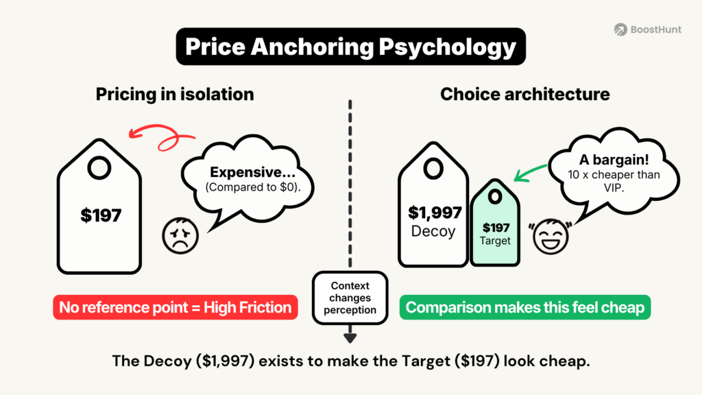
The UX Fix:
- Strike-Through Pricing: Display the “Total Value” (e.g., ~~$1,997~~) in a smaller, grey font next to the real price. This forces the brain to anchor to the higher sum, making your actual price feel like a logical “win” for the customer.
- Reverse the Reading Order: On your pricing table, place your High-Ticket or Annual price on the left (for Western markets that read left-to-right). Anchor them high immediately, so the standard option feels like “pocket change” by comparison.
- Value Stacking: Before revealing the price, list your bonuses with specific dollar values.
-
- Bonus 1 (Value $200)
- Bonus 2 (Value $500)
- Total Value: $700… Get it today for $97.
4. The Von Restorff Effect
The Science: Imagine walking through a dense green forest. Your brain effectively ignores millions of green leaves to conserve energy. But the second it sees a flash of ORANGE—a tiger—it locks on instantly.
This is the Von Restorff Effect (or Isolation Effect) in action. Discovered by psychiatrist Hedwig von Restorff, the principle states that when multiple similar objects are present, the one that differs is the most likely to be remembered. The brain prioritizes encoding this anomaly (the tiger) because it breaks the environment’s visual pattern.
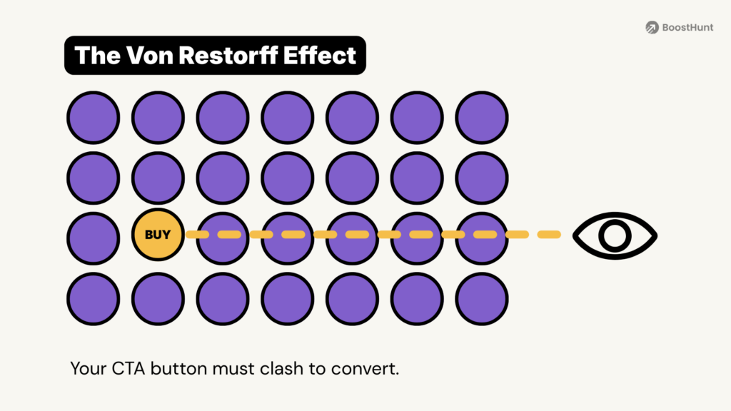
The UX Fix:
- Break the Pattern to Boost Retention: The Von Restorff effect isn’t just about getting clicks; it’s about ensuring retention. In your course slides or sales letters, avoid endless walls of bullet points. When you need a student to grasp a core concept, isolate it. Make that specific module distinct—use a contrasting background color or a significantly larger font size to signal importance.
- Reserve High Contrast for Primary Actions: You don’t need an ugly, clashing button; you need one that holds the highest visual weight. Use the Von Restorff effect to establish a clear hierarchy. Your primary conversion goal (e.g., “Enroll Now”) should be a solid, high-contrast color that doesn’t compete with secondary elements.
- Maximize Visual Salience: It’s not just about color; it’s about “salience” (how much an element stands out relative to its neighbors). While color is powerful, whitespace is equally critical for isolation. Giving your CTA button ample breathing room (padding) isolates it from the noise, making it the “tiger” without the need for neon colors.
Expert Warning: Use this sparingly. If everything stands out, nothing stands out. Focusing on too many “tigers” leads to cognitive overload and banner blindness.
5. Reciprocity
The Science: Asking a stranger to buy your $997 course immediately is like walking up to someone at a bar and asking: “Will you marry me?” The answer is “No”—not because you aren’t a catch, but because the sequence is wrong. The risk is too high.
This is Reciprocity. In human dynamics, you must invest before you withdraw. You buy the coffee (Lead Magnet) before you ask for dinner (Core Offer). If you skip the small “Yeses,” you will never get the “Big Yes.”
In the current digital landscape, reciprocity is closely tied to personalization. McKinsey’s ‘Next in Personalization’ report found that 71% of consumers expect companies to deliver personalized interactions. By offering a tailored ‘Lead Magnet’ (like a specific calculator rather than a generic eBook), you aren’t just giving value—you are reducing the user’s search friction, which 76% of consumers say is a key factor in choosing a brand.
The UX Fix:
- The “Value Debt” Strategy: Give away a specific, high-utility tool (a calculator, a Notion template, or a checklist). When you provide genuine value for free, the user feels a psychological “debt” and is more likely to consider your paid solution later.
- Remove the “Greedy Gate”: One of the biggest UX mistakes I see is requiring users to create an account just to see a curriculum or pricing. You are asking for their data before giving them answers. Give value first; gate the “implementation” later.
- The Foot-in-the-Door: If your main course is high-ticket, offer a “Tiny Offer” ($7–$27) first. The goal here isn’t profit—it’s to trigger the psychological shift from “Observer” to “Customer.”
6. Parasocial Interaction
The Science: Our brains haven’t evolved as fast as our screens. To your subconscious, a face on a video is processed almost identically to a face in the room. This creates a Parasocial Interaction—a one-sided relationship where the viewer feels they “know” and trust you. In my decade of running a UX studio, I’ve found that students don’t just buy information; they buy a connection with the expert.
The UX Fix:
- Build Authority Through Eye Contact: Don’t hide behind voiceovers. When you are selling a digital product, you are the product. Use “talking head” video formats for your sales pitches and introduction modules. Direct eye contact (even through a lens) triggers the release of oxytocin, bridging the gap between a cold transaction and a warm relationship.
- Convey Emotion to Contextualize Content: Emotions are contagious. If your thumbnail or video cover shows excitement, concern, or surprise, the viewer’s mirror neurons fire, priming them to feel the same way. Use your facial expressions to set the emotional tone of the lesson before they click play.
- The “Origin Story” Pivot: Don’t just show the polished success. Share your “Zero Moment”—the time you were struggling with the very problem your course solves. Vulnerability accelerates the parasocial bond because it proves you are a human, not a faceless corporation.
- Stop the Scroll with Your Face: In a sea of abstract graphics and text overlays, a human face is your strongest anchor. Analysis from ThumbnailTest highlights that incorporating a face—especially one showing genuine emotion—significantly improve click-through rates and viewer engagement. Whether it’s a YouTube thumbnail or a course welcome video, showing your face signals “trust” and “relevance” before the user even reads the title.
7. The Zeigarnik Effect
The Science: Named after psychologist Bluma Zeigarnik, this principle states that people remember uncompleted or interrupted tasks better than completed ones. The brain craves closure. If a song cuts off right before the chorus, it gets stuck in your head all day.
For instance, in marketing, we use this to create “Open Loops” that pull the reader through your sales funnel.
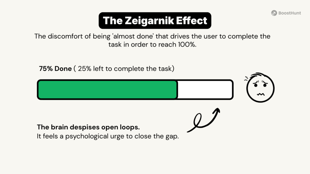
The UX Fix:
- The “What vs. How” Gap: In your free webinar or lead magnet, teach the What and the Why extensively. Then, “open the loop” by stopping right before the How. To close the loop and get the step-by-step implementation, they must join the course.
- Email Subject Lines: Use open loops like “The one tool I never use…” or “Why I almost quit last Tuesday.” The reader must open the email to close the mental loop.
UX Warning: Be careful not to leave too many loops open at once. In my UX audits, I’ve seen “loop fatigue” where a user feels teased rather than taught. Always ensure you provide enough value so the user feels rewarded for engaging, while still desiring the “final piece” of the puzzle.
8. The Endowed Progress Effect
The Science: Imagine two coffee loyalty cards.
Card A: “Buy 8 coffees, get 1 free” (0 stamps provided).
Card B: “Buy 10 coffees, get 1 free” (but 2 stamps are already provided).
Mathematically, they are identical. But research by Nunes and Drèze (2006) shows that people complete Card B almost twice as fast. Why? Because we hate “wasting” progress we’ve already made. If we feel we’ve already started a journey, we are biologically driven to finish it.
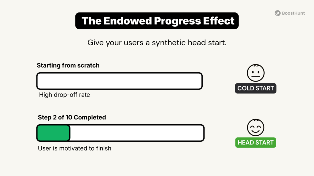
The UX Fix:
- The Pre-Filled Progress Bar: On your checkout page, place a visual progress bar at the top. Set it to 50% or 66% completion. Label it: “Step 2 of 3: Secure Payment.” The user subconsciously feels they’ve already finished Step 1 (the decision to buy), and abandoning the cart now feels like losing that momentum.
- The “First Win” Checklist: Inside your course onboarding, give them a “Success Checklist.” Make the first item: “Step 1: Join the Academy (Completed!).” Momentum is the greatest enemy of procrastination.
9. Choice-Supportive Bias
The Science: We’ve all felt it—the “stomach drop” ten minutes after a big purchase. “Did I really need this? Was it too expensive?” This is Post-Purchase Dissonance.
Therefore, to combat this, the brain looks for Choice-Supportive Bias—a psychological defense where we retroactively justify our decision. As a creator, you must trigger this manually. If you don’t, the panic wins, and the refund request arrives.
The UX Fix:
- The Validation Page: Your “Thank You” page is your most valuable real estate. Don’t just show a receipt. Show a video of yourself saying: “You just made an incredible decision. You’re now part of the top 1% who take action. Here is exactly what happens next.”
- The 15-Minute Win: Ensure the first module of your course is short (under 5 minutes) and delivers a tangible “micro-win.” Validating their purchase instantly kills the urge to refund.
10. Loss Aversion
The Science: According to Prospect Theory (pioneered by Nobel laureate Daniel Kahneman), the pain of losing $100 is roughly twice as powerful as the pleasure of gaining $100.
Most creators focus 100% on the “Gain” (e.g., “Grow your business”). But biologically, the human brain works harder to avoid pain than to achieve pleasure. If you only sell the dream, you are ignoring the brain’s strongest motivator: the fear of missing out or losing what they already have.
Loss aversion is one of the strongest psychological triggers for course sales because the brain hates losing more than it loves gaining.
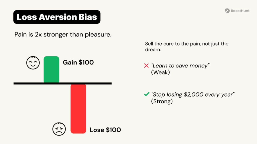
The UX Fix:
- Reframe Your Headlines: Don’t just promise a benefit; imply a loss if they stay on their current path.
- Gain-based: “Learn how to save money on taxes.”
- Fear-based: “Stop overpaying the IRS. You may be losing $2,000 every year by missing these specific deductions.”
- Risk Reversal: A user hesitates because they fear the loss of their money more than they desire your course. You must remove the “Loss” from the equation.
- Micro-Copy Tip: Instead of a generic “30-Day Guarantee,” try: “I am taking all the risk. If you don’t love it, you don’t lose a penny.” This directly addresses the brain’s fear center.
CONCLUSION: Beyond the Content – Building the Engine
Mastering these 10 psychological triggers is what separates a “digital course” from a high-performance sales ecosystem. However, here is the hard truth: knowing the science is easy; executing it is where most creators fail.
Unfortunately, wrestling with disjointed tools and slow checkout pages is the primary cause of course creation tech fatigue. When your technology doesn’t support human biology, your conversion rates will always underperform, regardless of your expertise.
These 10 psychological triggers for course sales work 10× better when your tech stack isn’t fighting against human psychology. We built BoostHunt as the done-for-you online course infrastructure that removes the technical tax so you can finally focus on the psychology of selling.
Join the BoostHunt Beta We are currently in a Closed Beta phase, working with a select group of ambitious creators to stress-test our infrastructure before the official launch. If you want to stop being a “Systems Administrator” and start being an Experience Architect, we’d love to have you join us.
We are trading our high-end tech and setup services for your honest feedback and data-backed results.
👉 Apply for the BoostHunt Beta Here No cost during Beta. Just your expertise and your feedback.
📚 References & Further Reading
If you want to dive deeper into the psychology behind these principles, here are the original studies and some highly recommended articles that explain how to apply them in business and design.
1. Hick’s Law (Cognitive Load)
- The Science: Hick, W. E. (1952). On the rate of gain of information.
- 📖 Recommended Reading: Hick’s Law: Making the Choice Easier for Users (Interaction Design Foundation)
2. The Jam Study (Choice Overload)
- The Science: Iyengar, S. S., & Lepper, M. R. (2000). When Choice is Demotivating.
- 📖 Recommended Reading: More Isn’t Always Better
3. Endowed Progress Effect (Loyalty)
- The Science: Nunes, J. C., & Drèze, X. (2006). The Endowed Progress Effect.
- 📖 Recommended Reading:
4. The Zeigarnik Effect (Unfinished Tasks)
- The Science: Zeigarnik, B. (1927). On Finished and Unfinished Tasks.
- 📖 Recommended Reading: What Is the Zeigarnik Effect? (Verywell Mind).
5. Isolation Effect (Von Restorff Effect)
- The Science: Von Restorff, H. (1933). On the Effects of the Formation of a Structure in the Trace Field.
6. Decoy Effect & Anchoring
- The Science: Ariely, D. (2008). Predictably Irrational.
- 📖 Recommended Reading: The Decoy Effect / Anchoring Bias (The Decision Lab)
7. Prospect Theory
- The Science: Kahneman, D., & Tversky, A. (1979). Prospect Theory: An Analysis of Decision under Risk. Econometrica, 47(2), 263–291.
- 📖 Recommended Reading: Nielsen Norman Group: Prospect Theory and Loss Aversion: How Users Make Decisions. Source: https://www.nngroup.com/articles/prospect-theory/

